
Light and Saber Pairs 2026
It’s late July, early August, so it is time for the annual Light&Saber Listicle. To clarify language here is my article about the price brackets. The goal of this article is to recommend to you a knife and a light that
This year represents a huge shift for two reasons. First, a lot of my favorite gear is no longer in production. Second, inflation has destroyed the market. I feel like those two things might be related. It might be that the old stuff I liked is too expensive now to make at a profit and so those things have been discontinued in favor of cheaper-to-make products. Or, they have been priced out of the bracket they were in.
This impacted the flashlight in the High End quite a bit. I still have and love my Oveready BOSS 35, but it is out of production. I also still have and love my Dawson Machinecraft Hoku Clicky, but it is also OOP and it has been replaced by lights that are almost a half inch longer. Frelux has a message about moving to Texas (please don’t quit the game Ben). I still haven’t managed to snag a CWF Peanut, so that is still a possible pick. I am not necessarily disappointed where the High End landed, the VME is an all time great and McGizmo still makes lights, but the number of pure function lights in this price range has dropped considerably. There is a bunch of machining feats with mediocre guts now. It is sad to see this part of the market dying out.
Most entities that deal with inflation, like municipal, state, and federal government agencies, have an annual cost of living adjustment. These are pinned at around 2.5% annually, give or take a few tenths of a percent. So when inflation is over that amount, people see problems show up when dealing with everyday expenses. Inflation has not been below 2.5% since 2020, which, if you don’t remember was the age of Covidpocalypse. Since then we have seen inflation destroy consumer buying power. Part of that was because we were responding to unprecedented economic challenges in the wake of a global pandemic. The other part is that we are engaging in self-injurious stupidity with tariffs and unprovoked military action that reduces the flow of the global oil supply. As a result, virtually everything is different. And not in a good, innovation-is-a-boon-for-consumers kind of way. The knife that should be in the enthusiast bracket, the Spyderco Sage 6 in S90V, is now too pricey for the pair to cost under $300. Even the other knife that is cheaper, the TRM N2, is now pricey enough that it greatly restricts what light you can buy. The Gear World is in dark times.
As a bonus I broke the high end into high end and REALLY nutty high end.
Budget: $50 or Less
Ozark Grail 2 ($19.95)
Grind off the stupid tanto grind and you have a great knife. If you don’t, well it’s still a pretty good knife. I know why Wal Mart gave it a tanto, as a means of distinguishing it from the original Ozark Grail, but this knife is leagues better than that one with an excellent steel, better fit and finish, and a sculpted aluminum handle. It’s a hell of a knife for $20. I’d look at a Victorinox Bantam if you didn’t want this knife.
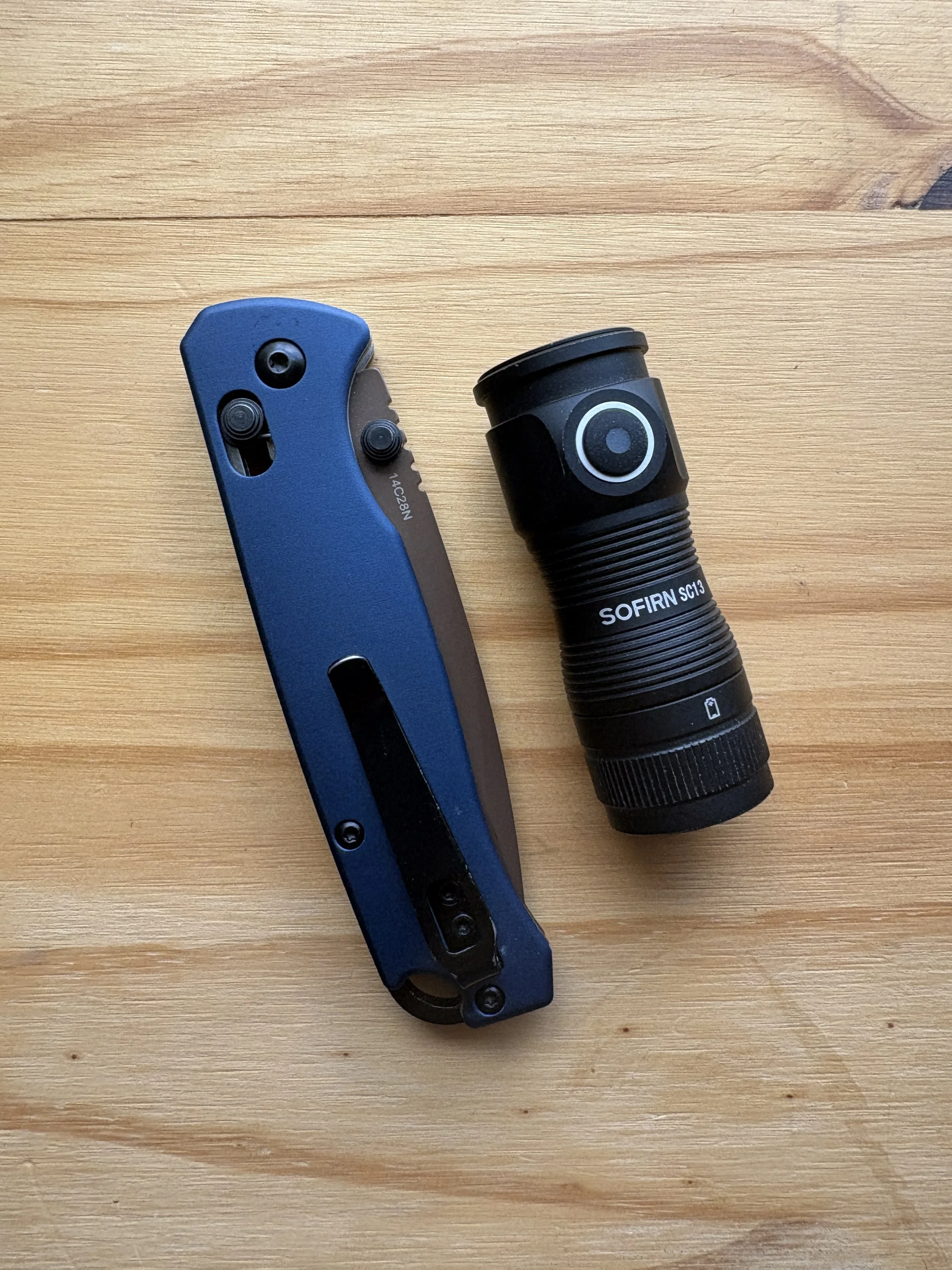
Sofrin SC13 Mini ($19.95)
This is basically a budget version of the great 47 Mini Turbo, but with a side clicky. Sure, its beam is not great thanks to a Fresnel lens instead of a true TIR and the button protrudes in a way that all but invites hot pocketing, but at $19 this is a really good light. It blows away a lot of the stuff you will find at Big Box and is around the same price. If you go for the branded lights like stuff from Milwaukee or DeWalt, it is half the price. Amazon’s price is too high, so I didn’t bother with a link. You can pretty easily find it for cheaper than the $30 Jeff Bezos wants you to pay.
Entry Level: $100 or Less
Civivi Baby Banter 2 TG ($67.95, purchase link)
Eventually some formulation of this design was going to be a grand slam home run and this one is it. It looks good, which is not something I could say for every version of the original, sports good steel, and has the classic olive green/deep red color combo that knife knuts love.
Lumintop Tool v3 ($28.95, purchase link)
This light does stuff no other light does, regardless of price. The use of secondary RGBs as tritium is pretty cool and a real differentiator in the market. The light itself is pretty awesome, too. Good color rendering, good price, and decent clip.
Enthusiast: $300 or Less
Spyderco Dragonfly in SPY27 ($94.95, purchase link)
The Dragonfly has been in a dark place for a while, larding up on high speed tool steels and, weirdly, high toughness steels (who is out there doing this kind of cutting with a DRAGONFLY?). But I am thoroughly unconvinced that this the right direction for the Dragonfly to go. Of course these exotic steels probably sell well and they are great on the secondary market, but if you are USER you want something more balanced than the instant rust magnet that is K390. The SPY27 version of the Dragonfly fits the bill and quite frankly this should be the evergreen version (ditch VG-10 please). At $94.95 and 1.3 ounces you will not find a better everyday carry knife. Some are its equal, but none are its superior. And given the inflation that is ravaging the economy, I thought it would be nice to have a pair here that is $100 LESS than the bracket limit. Two other considerations: the Kershaw Bel Air and the Hogue Deka are great knives too, but both are at least $25 more.
Zebralight SC65 Hi ($99.95)
Man, is this light good. The sadness associated with the collapse of the high end part of market is balanced out by just how good this light is. It pops in and out of availability, so if you have the means you should pull the trigger today. The emitter is incredible, you get the great Zebralight side switch ergos, and it is the most space efficient 18650 ever, smaller than many 1x CR123a lights. It doesn’t have the brightest high, but it is bright enough for long enough that it will outpace many flamethrowers, especially those of the built in battery kind.
High End: More than $300
Option 1: You AREN’T crazy
Spyderco Sage 6 S90V ($299.95)
There are a few knives I considered here. The TRM N2 is a favorite. The TRM Bulldog Rev B might actually be the best knife TRM has ever made. The Tactile Knife Co Rockwall is spectacular. I could see a case for the S90V Mini Bugout and the Hogue Saxum as well. Of course there is always the Chris Reeve Sebenza. But in the end, the simplicity and performance of the Sage 6 is hard to beat.
Kosen VME ($199.95)
This compact, simple light is what you get when you strip alway the gilding on the McGizmo Haiku, boost its output, increase the color rendering, and give it a no nonsense clip. This might be the best light ever made in terms of pure function. It also doesn’t have the 90 second drop down almost all modern lights do, meaning the 500 lumen high is really 500 lumens.
Option 2: You ARE that crazy.
Anso Aros (price varies, starts at $760)
Anso updated the Aros to a 2.0 version, but a lot is still the same—the button lock, the handle and blade shape, the blade steel. It appears as though a lot of the changes were made to make the knife easier to produce, which is fine. This little gem is an absolute design masterpiece and makes be think there is not much reason to venture into the custom realm, especially when most “custom” folders are giant and mostly just bling.
McGizmo Haiku (price varies, purchase link)
I had to look up if these were still being produced and they are. The options are much broader than when I got the light nearly 18 years ago. They have 1xAA, 1x123, 2xAA, and 2x123 body tubes, they have a choice of emitters, and they have a normal, mule, sun drop, and throw head. The reflector on the Haiku is still the very best in the entire world, the clicky is the standard for the industry, and the machining is absolutely perfect.
Amazon Links