
Karas Kustoms Ink Review
Karas Kustoms is the kind of company making the kind of products that I love to highlight on this blog. They are uniformly excellent designs, made by and for enthusiasts, and they are a small business making stuff here in the US. Dan Bishop of Karas Kustoms reached out to me after I was on the Pen Addict Podcast and asked if I wanted to review the Ink and I told him I'd be thrilled.
In the months that I have had the Ink I have come to love it. Its not perfect, but few things are. What it does have is an abundance of character. I think it is fair to say that the fountain pen world has some...um...staid designs. To be sure there are some great pens out there, even ones housed in bland bodies, but truly eye catching, never-before-seen pens are rare, especially for under $100. Karas Kustoms changed that with the Ink and I think there is an argument to be made (which, of course, I will make in this review) that between its gorgeous strong look and robust design, there is nothing quite like the Ink--it has no true competitors. And when you have a product like that, its worth exploring in detail.
Twitter Review Summary: Like nothing else out there.
Design: 2
In the 1970s there was a phase of architecture and building construction, especially on college campuses, that came to be known as the Brutalist style (the name comes from the French for raw concrete, not its brutal look, though both are appropriate). Huge, hulking buildings were made that looks like cinder blocks writ large. They were sprawling structures that looked like they were defensive positions in a futuristic castle (and, in fact, according to urban legend these buildings were popular for government facilities and universities because of the perceived threat of occupation by protestors and/or students--this is, of course, not true). The hallmark of the style is the use of raw concrete and heavy structural elements with little concern for grace or beauty.
I mention this because by comparison to the overwrought, gilded lilies of the fountain pen world, the Ink is a "Brutalist" fountain pen. It is angular; clean almost to the point of sterility, and seemingly without concern for comfort. There is Industrial and then there is the Ink. But underneath that sharp edged look is a grace entirely lacking from Brutalist structures. This is not the Humvee of Fountain Pens. Its something else, something more complex and more interesting. This is a pen that looks tough, but writes fluidly--an M1A1 Abrams tank with the nimble handling of a Lotus Exige.
In that sense it is utterly unlike anything else in the fountain pen world. And because of that difference from the crowd, despite its flaws, it was something that charmed me. It is so uniquely different that it has a beauty and logic all its own. The Ink is truly a hard use fountain pen, for all of the contradictions that statement has in it. Its design is a testament to the skill and eye of its creator, Dan Bishop.
Fit and Finish: 2
The difficulty of making an aluminum pen as nice as a resin-based pen are pretty obvious. Given the comparative hardness of the materials, everything in an aluminum pen is just more difficult to do--smooth threads, parts mating up, and consistency of finishes (anodizing is particularly fickle). But given Karas's history as a machine shop and parts maker for hot rods, they know how to make metal work. Karas could have taken the easy way out and used a plastic insert for the threads but they didn't--the threads are cut into the aluminum body here.
Every piece of the Ink is very nicely made. The threads are smooth, the body tube parts mate well, and even the screws on the clip look clean and polished. There is no slop or movement anywhere. Even the grip area is well done, something that is problem on machined pens, where graceful curves are hard to do. The anodizing is like a good cup of coffee--clean, rich, and dark (on the light colored ones it pops appropriately). In short, there is nothing concerning about the pen from a finish perspective.
Carry: 1
Simple, obvious problem:
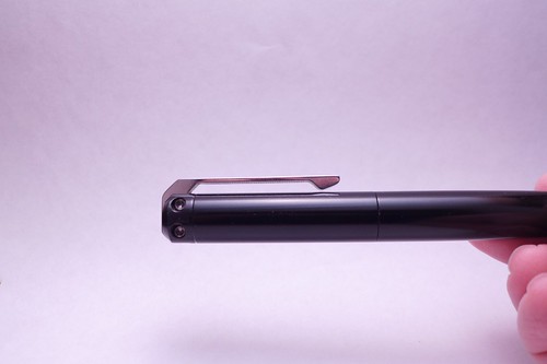
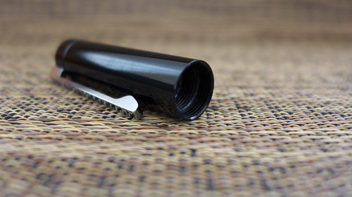
This isn't so much a pocket clip as it is a pocket hook. It worked okay, but the pen didn't stay put in the pocket because the clip failed to make contact with the pen's cap. It would either slide around on the lip of the pocket or it would actually slide out. The clip is plenty strong, but not super secure. Aside from that issue, the pen carried well. It wasn't particularly bulky and its solid body did not make me worry about where and what I did with the pen while it was in my pocket.
Appearance: 2
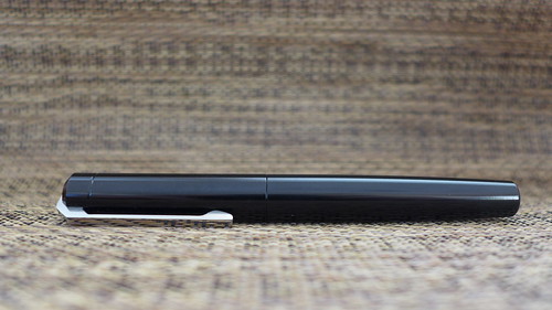
Going back to to the Brutalist look, the Ink certainly looks like a tool and less like a fancy ornament found on a banker's (or lawyer's) desk. The exposed screws, the thick, sturdy pocket clip and the resolute lines make the Ink look solid. That said, if you are looking for something that communicates "fancy", which is one reason to carry a nice pen, the Ink won't fit the bill, not because it isn't nice, but because it doesn't look like a conventional higher end fountain pen. There are a few options at the $85-105 price point that would fit that bill. I am not a "fancy pen" guy, so the nontraditional appearance doesn't bother me in the least.
Durability: 2
In a pinch I feel like someone could shoot this thing out of a shot gun with little problem.
There are very few pens, let alone fountain pens, that can withstand the crazy travel, weird writing surfaces, and long writing sessions that I put pens through. The Ink is one of them. I can't think of a fountain pen as tough as the Ink.
Writing Performance/Refill: 2
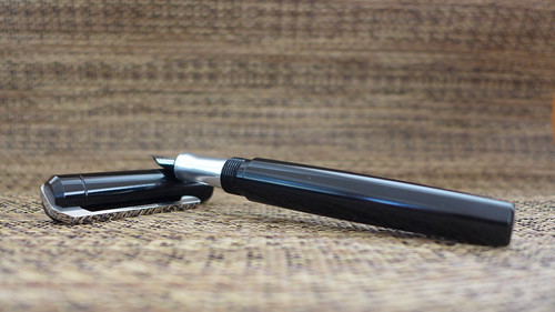
The piston filler converter is definitely NOT EDC friendly, but the Ink can use standard international cartridges and its big enough to piggyback (put one cartridge in and another behind it in the body tube). This set up gives you as much writing stamina as the converter with MUCH, MUCH less mess. I am sure I would get better over time using the converter, but refilling it three times during the review period was enough to convince me that absent surgeon-level hand eye coordination there is going to be some stray ink somewhere in the process.
Balance/In Hand Feel: 2
This is where the Ink really surprised me. You'd never think the interior of a Brutalist build would be plush and comfortable, but with a pen designed in a similar style that is exactly what you get.
The pen's balance is exquisite and its length is just right. You don't feel like your writing with an 8 foot long 2x4, but at the same time you don't feel like you stole a kindergartener's pen. Put some orange or topaz ink in this puppy and color me surprised.
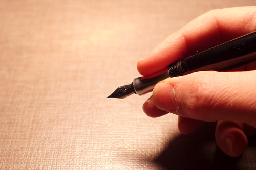
Grip: 2
As you can see above there is some real curve to the grip section and that makes the Ink positively inviting to the hand. There are lot of machined pens (aka Kickstarter pens) that look awesome but feel like a medieval torture device in the hand. Its easy to machine knurling, straight lines or round holes, but curves--that is a different matter and with the Ink the Karas guys flexed their machining muscle and did it just right.
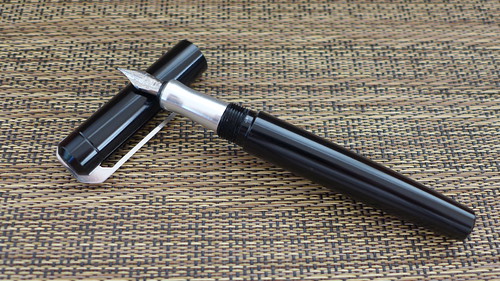
Barrel: 2
Its not the tortoise shell or resin swirl beauty that many expect with a fountain pen, so if that's your bag, this isn't your pen, but I have said that before. If you can look past or don't need the traditional aesthetic, the clean stocky barrel is sweet. The machining is so fine that it is a pleasure to handle (or more honestly caress...). The chamfering at the end is a nice touch and prevents the pen from being too crisp.
Deployment Method/Cap: 1
It doesn't post securely, so that's a point off, but it also doesn't feel flimsy or breakable like some of the Twsbi caps out there (honestly that is the sole reason you haven't seen a Twsbi reviewed here). I'd like a truly postable cap, but its not the end of the world.
Overall Score: 18 out of 20
This isn't the best pen I have reviewed. This isn't a perfect pen. But the Ink, for me, is a beloved pen. I can overlook the weird clip design and the fact that the cap doesn't post because the in hand feel is great, the nib is nice, and the build is unique, striking, and durable. Dan over at Karas Kustoms has made quite a few nice pens, the Render K, the Retrakt, and the Bolt, but the Ink is truly next level design. Its not just a solidly made object, its one with soul, and in the end, that's something I always want. When you toss in the fact that its build like an M1A1 (or A2 if your a techy), it just might be the perfect pen for a hard user like myself--durable enough to stand up to travel and lots of writing, but with a nib nice enough to spare your hand from cramping after an intense note taking session. This is a damn good mid-priced fountain pen. And with all of the color combinations, you can certainly find something you'll like.
In the months that I have had the Ink I have come to love it. Its not perfect, but few things are. What it does have is an abundance of character. I think it is fair to say that the fountain pen world has some...um...staid designs. To be sure there are some great pens out there, even ones housed in bland bodies, but truly eye catching, never-before-seen pens are rare, especially for under $100. Karas Kustoms changed that with the Ink and I think there is an argument to be made (which, of course, I will make in this review) that between its gorgeous strong look and robust design, there is nothing quite like the Ink--it has no true competitors. And when you have a product like that, its worth exploring in detail.
Here is the Ink product page. It costs $85. Here is a video review of the Ink. Here is a written review of the Ink. Here is my review sample (provided by Karas Kustoms and to be given away):
Twitter Review Summary: Like nothing else out there.
Design: 2
In the 1970s there was a phase of architecture and building construction, especially on college campuses, that came to be known as the Brutalist style (the name comes from the French for raw concrete, not its brutal look, though both are appropriate). Huge, hulking buildings were made that looks like cinder blocks writ large. They were sprawling structures that looked like they were defensive positions in a futuristic castle (and, in fact, according to urban legend these buildings were popular for government facilities and universities because of the perceived threat of occupation by protestors and/or students--this is, of course, not true). The hallmark of the style is the use of raw concrete and heavy structural elements with little concern for grace or beauty.
I mention this because by comparison to the overwrought, gilded lilies of the fountain pen world, the Ink is a "Brutalist" fountain pen. It is angular; clean almost to the point of sterility, and seemingly without concern for comfort. There is Industrial and then there is the Ink. But underneath that sharp edged look is a grace entirely lacking from Brutalist structures. This is not the Humvee of Fountain Pens. Its something else, something more complex and more interesting. This is a pen that looks tough, but writes fluidly--an M1A1 Abrams tank with the nimble handling of a Lotus Exige.
In that sense it is utterly unlike anything else in the fountain pen world. And because of that difference from the crowd, despite its flaws, it was something that charmed me. It is so uniquely different that it has a beauty and logic all its own. The Ink is truly a hard use fountain pen, for all of the contradictions that statement has in it. Its design is a testament to the skill and eye of its creator, Dan Bishop.
Fit and Finish: 2
The difficulty of making an aluminum pen as nice as a resin-based pen are pretty obvious. Given the comparative hardness of the materials, everything in an aluminum pen is just more difficult to do--smooth threads, parts mating up, and consistency of finishes (anodizing is particularly fickle). But given Karas's history as a machine shop and parts maker for hot rods, they know how to make metal work. Karas could have taken the easy way out and used a plastic insert for the threads but they didn't--the threads are cut into the aluminum body here.
Every piece of the Ink is very nicely made. The threads are smooth, the body tube parts mate well, and even the screws on the clip look clean and polished. There is no slop or movement anywhere. Even the grip area is well done, something that is problem on machined pens, where graceful curves are hard to do. The anodizing is like a good cup of coffee--clean, rich, and dark (on the light colored ones it pops appropriately). In short, there is nothing concerning about the pen from a finish perspective.
Carry: 1
Simple, obvious problem:
This isn't so much a pocket clip as it is a pocket hook. It worked okay, but the pen didn't stay put in the pocket because the clip failed to make contact with the pen's cap. It would either slide around on the lip of the pocket or it would actually slide out. The clip is plenty strong, but not super secure. Aside from that issue, the pen carried well. It wasn't particularly bulky and its solid body did not make me worry about where and what I did with the pen while it was in my pocket.
Appearance: 2
Going back to to the Brutalist look, the Ink certainly looks like a tool and less like a fancy ornament found on a banker's (or lawyer's) desk. The exposed screws, the thick, sturdy pocket clip and the resolute lines make the Ink look solid. That said, if you are looking for something that communicates "fancy", which is one reason to carry a nice pen, the Ink won't fit the bill, not because it isn't nice, but because it doesn't look like a conventional higher end fountain pen. There are a few options at the $85-105 price point that would fit that bill. I am not a "fancy pen" guy, so the nontraditional appearance doesn't bother me in the least.
Durability: 2
In a pinch I feel like someone could shoot this thing out of a shot gun with little problem.
There are very few pens, let alone fountain pens, that can withstand the crazy travel, weird writing surfaces, and long writing sessions that I put pens through. The Ink is one of them. I can't think of a fountain pen as tough as the Ink.
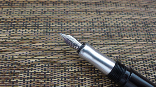
Writing Performance/Refill: 2
The nib, a Schmidt nib, is marvelous. This was my first fine nib and it was perfectly precise, which is why you get a fine nib. The page feel with the fine nib was excellent--scratchier, of course, than my preferred medium nib (the medium GOLD nib on my Vanishing Point is like writing with a stick of butter on a hot pan...smooth, smooth, smooth), but better than I thought it would be. The feedback was JUST right. You can feel the texture of the paper, but at the same time you don't feel like your writing on speed bumps. Very impressive. I'd love to try this in a gold nib, as my VP has spoiled me.
The piston filler converter is definitely NOT EDC friendly, but the Ink can use standard international cartridges and its big enough to piggyback (put one cartridge in and another behind it in the body tube). This set up gives you as much writing stamina as the converter with MUCH, MUCH less mess. I am sure I would get better over time using the converter, but refilling it three times during the review period was enough to convince me that absent surgeon-level hand eye coordination there is going to be some stray ink somewhere in the process.
Balance/In Hand Feel: 2
This is where the Ink really surprised me. You'd never think the interior of a Brutalist build would be plush and comfortable, but with a pen designed in a similar style that is exactly what you get.
The pen's balance is exquisite and its length is just right. You don't feel like your writing with an 8 foot long 2x4, but at the same time you don't feel like you stole a kindergartener's pen. Put some orange or topaz ink in this puppy and color me surprised.
Grip: 2
As you can see above there is some real curve to the grip section and that makes the Ink positively inviting to the hand. There are lot of machined pens (aka Kickstarter pens) that look awesome but feel like a medieval torture device in the hand. Its easy to machine knurling, straight lines or round holes, but curves--that is a different matter and with the Ink the Karas guys flexed their machining muscle and did it just right.
Barrel: 2
Its not the tortoise shell or resin swirl beauty that many expect with a fountain pen, so if that's your bag, this isn't your pen, but I have said that before. If you can look past or don't need the traditional aesthetic, the clean stocky barrel is sweet. The machining is so fine that it is a pleasure to handle (or more honestly caress...). The chamfering at the end is a nice touch and prevents the pen from being too crisp.
Deployment Method/Cap: 1
It doesn't post securely, so that's a point off, but it also doesn't feel flimsy or breakable like some of the Twsbi caps out there (honestly that is the sole reason you haven't seen a Twsbi reviewed here). I'd like a truly postable cap, but its not the end of the world.
Overall Score: 18 out of 20
This isn't the best pen I have reviewed. This isn't a perfect pen. But the Ink, for me, is a beloved pen. I can overlook the weird clip design and the fact that the cap doesn't post because the in hand feel is great, the nib is nice, and the build is unique, striking, and durable. Dan over at Karas Kustoms has made quite a few nice pens, the Render K, the Retrakt, and the Bolt, but the Ink is truly next level design. Its not just a solidly made object, its one with soul, and in the end, that's something I always want. When you toss in the fact that its build like an M1A1 (or A2 if your a techy), it just might be the perfect pen for a hard user like myself--durable enough to stand up to travel and lots of writing, but with a nib nice enough to spare your hand from cramping after an intense note taking session. This is a damn good mid-priced fountain pen. And with all of the color combinations, you can certainly find something you'll like.